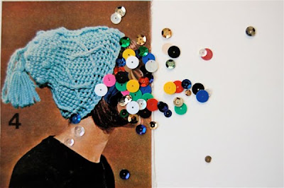
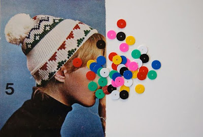
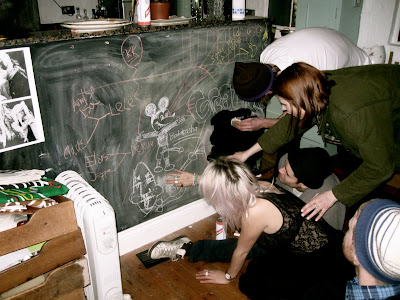
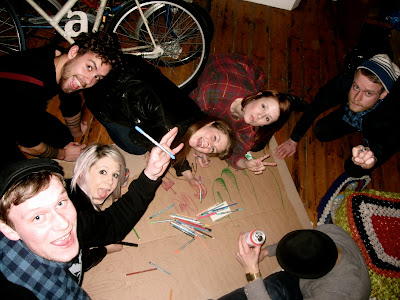
I had to do this Grace. I have fallen head over heels for it too... The synchronised dance especially.
Word of the day
Bloody jellyfish
The Italian artist Alberto Seveso is the man behind these liquidised texture waves. The red photography series is called 'Medicina Rossa' and the blue 'Sequenza Blu/Verde'. His magic trick is simply pouring ink into a tank of water and then clicking away- with precision and timing! This work reminds me of Carl Angelo's experiments for his typeface 'Hydrophobic', only that he mixed olive oil, sunflower oil and oil paint (purple and orange) to create his shapes in the water. I just love the three dimensional illusions these varnish swirls generate.


Paper pattern dress
Paper-mâché
It feels like I've spent an entire day in kindergarden, I even wore an apron with strawberries on it. Today has reminded me of how fun playing around with wire mesh and paper-mâché actually is! Even though the landscape construction has a long way to go it's already got quite a sculpturistic feel to it. I like it.


Yellow
The work of the Berlin-based German artist Hans Hemmert revolves around an obsession with air and latex. The unthinkably large balloons sculpt a familiar environment as seen in the photos below, where a room in his Neukölln apartment has been entirely covered with yellow latex.
Creatures
Every Monday should start like this...
Ono
Working hard as a rock on a music video with Carolina Melis for the Danish band Oh No Ono (Leaf). The song which we will be making the visuals for is called 'Internet Warrior' and hopefully will be launched in the beginning of May 2010. All I can say is; hairy.

Nuit Comme Oui // Logo ideas
I am currently working on a series of illustrations for the Danish fashion label Nuit Comme Oui, founded by my friend Natasja Qvitzau Lund. The re-interpretations of the origami inspired draped wonders will hopefully have a fresh and very home-made appeal. Additionally it will be reflecting the dreamy universe of Nuit Comme Oui. The illustrations will be featured on the website soon. Below is a few rough ideas that I did, using the logo as my starting point.


Juvenile
Luke Rudolf's paintings are special. There is a playful origami-like cut out feel to his works and the smears of paint across the layers emphasize the facial features or the disillusion of these. His colours are spectacular, especially the use of saturation and contrast. Also, this guy used to go to Chelsea College back in the 90s!


Harpers Bazaar
Incredible work by photographer Richard Avedon of lush looking ladies from the sixties spiced up with Day-Glo space helmets, designed by art directors Ruth Ansel and Bea Feitler. The most interesting attribute to these however is the mock-up like finish with hand written scribbles, arrows, pieces of masking tape and colour samples as part of the framing.


Illustration workshop - Design Principles


Stuart said: "You have until 3 PM and you will exhibit in the Well Gallery."
We each made illustrations on white A3 sheets of paper based on design principles. Everyone had to include the following in their work; 2 images + 1 coloured geometric shape + 3 black squares (4, 6, 8 cm) + an expressive mark + appropriate word relating to imagery. Here are the results.


This is my Bauhaus attempt...

Typographic exercise in pairs of two, working on A2. We had to illustrate the word 'love' by 'discord'.


Subscribe to:
Comments (Atom)


